

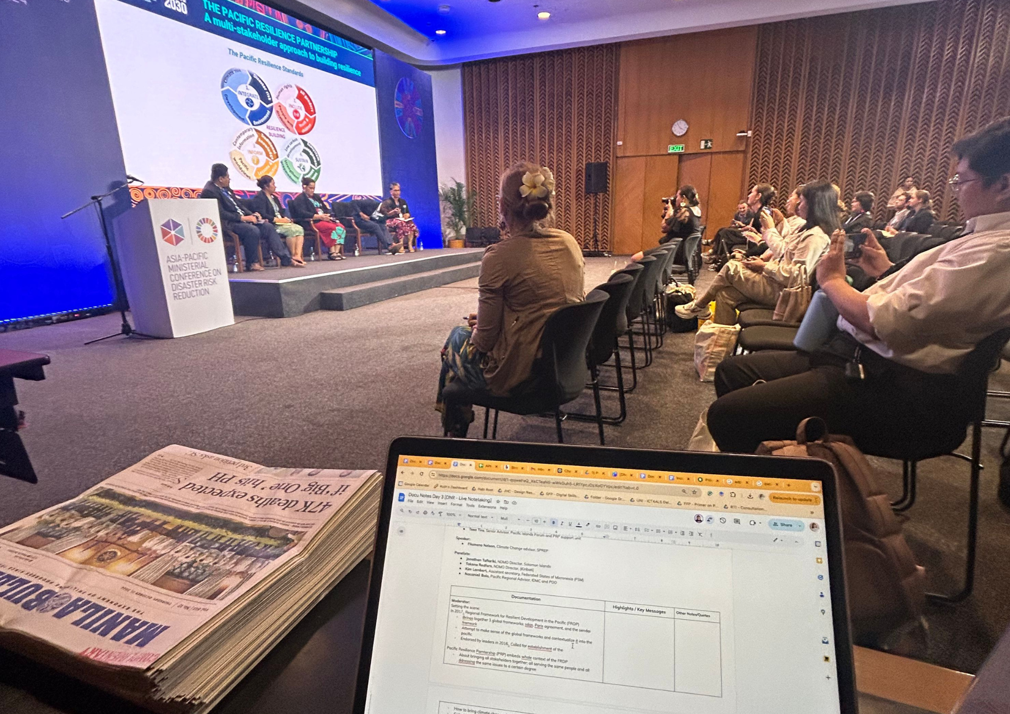
Considering the range of possibilities on how to present information to various groups of people and the multitudes of ideas we want to highlight, there’s a huge tendency for us to be derailed from our design intentions. What kept us on track was anchoring our work on Habi’s design principles. Ultimately, we want to create a well-designed learning experience – a clear, inclusive, human, and inspiring visual notes on Disaster Risk Reduction (DRR).
Malinaw/Clear
In this project, we intentionally weaved various ideas from different panelists and speakers through the use of visual cues (i.e., use of hierarchy and spacing, color patterns, shapes like speech bubbles) to inform the structure of the content. These visual cues in design guide the reader’s eye, making it easier for them to understand and process information.
In a technical conference such as this, our intent was to make the information as digestible and understandable as possible so that there’s less room for confusion and the participants could easily pick up and recall DRR best practices. We did this by ensuring that the ideas are as specific as they can be, defining technical terms, laymanizing complex concepts, spelling out the acronyms, and even citing references to the articles.
Kasya Lahat/Inclusive
At Habi, we believe that everyone is an expert of their own experiences and deserves to be heard. Although each session featured a number of panelists, we still tried to capture and summarize as many narratives, thoughts, and insights as possible. These diverse stories offered valuable lessons, fostering learning among the readers.
In line with our hope to advocate for inclusivity, we also applied the Gender Equality, Disability, Social Inclusion (GEDSI) approach in presenting the information through our visual content. By using graphics to represent a broad spectrum of genders and backgrounds, we ensured that the notes were not only accessible but also reflective of the diversity that we aim to celebrate and promote, reinforcing the values of equality, social inclusion, and respect for all.
Makatao/Human
By including reflection points and thought-provoking questions in some parts of the visual notes, we aimed to invite them into deeper thinking and engage them to spark conversations with others. This element was meant to encourage the readers to connect with the material on a more personal level, fostering a sense of involvement and making the learning experience more relevant to their work, studies, and personal lives.
Other than that, we also provided digital access, allowing them to explore the notes at their own pace and convenience. This kind of flexibility enables them to engage with the content in a more personal and meaningful way. This was also meant for them to bring the ideas back to their own countries.
Nagsusulong/Inspiring
True to the nature of visual notes, we wanted our output to be more than just informative – they needed to provide a delightful experience to the readers as well. As we were creating the visual notes, we prototyped and played a lot with dynamic layouts, colors, and visuals to keep the content lively while maintaining its credibility.
To further spark engagement, we wove in inspiring quotes, real-life impact stories, and calls-to-action from the panelists themselves. These elements didn’t just highlight key takeaways but also encouraged reflection and action.
APCDRRM - Live Notes by Jichele Urma
Afterall, it’s more than just notes. It’s about creating an experience that connects, educates, and motivates people to make a real difference in disaster risk reduction and resilience.
Want to learn more about what we do? Email us at kumusta@habieducationlab.org and share your vision with Habi!